




Deep dive 01 · Customized shadcn component
Button
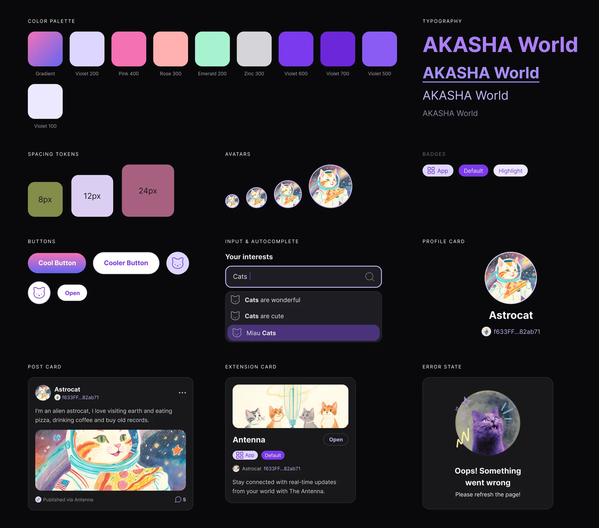
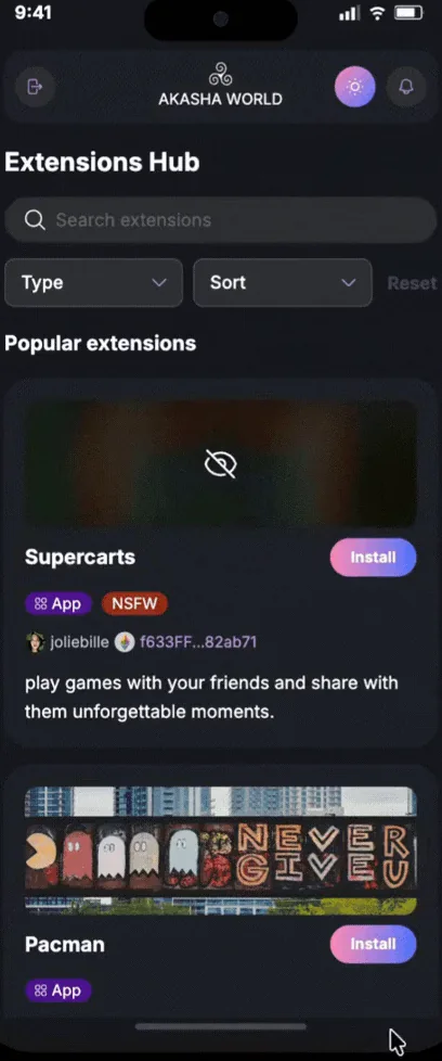
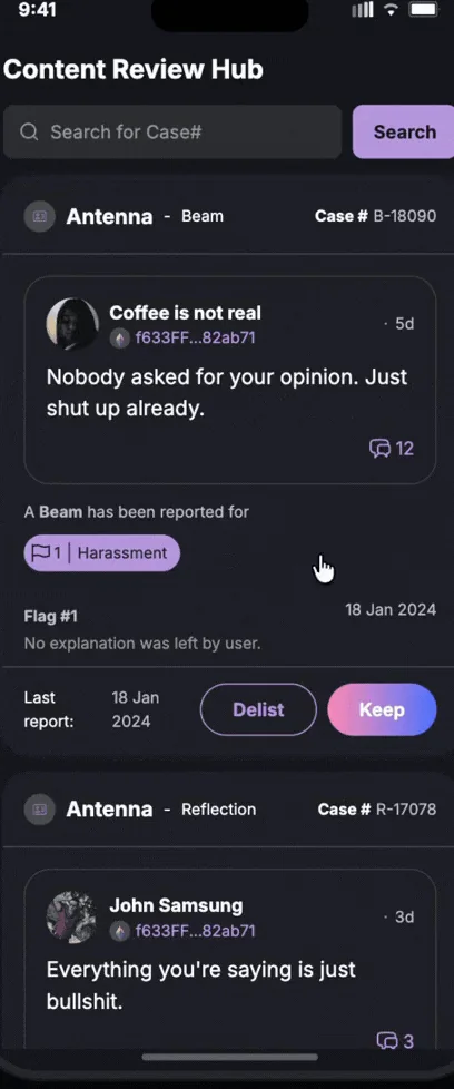
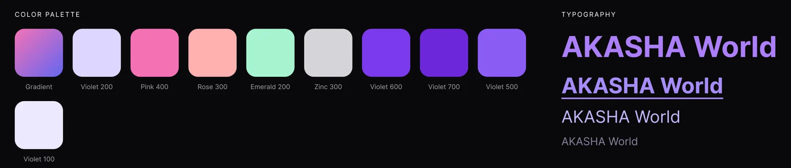
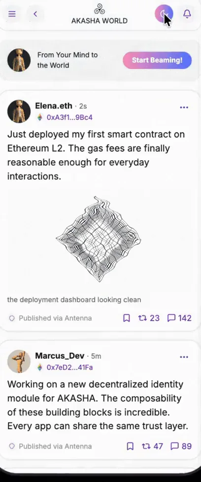
A shadcn Button, customized: the default variant became the AKASHA gradient, hover dims it, and the shape became a pill.
Button documentation (opens in a new tab)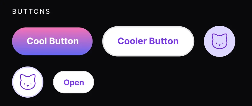
- Anatomy
- Container40px high (32px small), pill-shaped through the button's scoped --radius, 8px gap
- Label14px bold (12px at small)
- Iconoptional, 16px, either side
- Spinnerreplaces the content while loading
- Variants and sizes
- Default (gradient)
- Secondary
- Outline
- Ghost
- Destructive
- Link
- Default 40
- Small 32
- Icon 40
- States
Hover Default dims to 70% opacity; outline and ghost take the accent fill; secondary and destructive drop to 80% and 90% of their fill Focus 4px ring at 10% of --ring (20% in dark) plus a 1px outline Disabled 50% opacity, no pointer events Loading Disabled, with a spinner in place of the label - Tokens, light theme
--primary-start--primary-end--primary-foreground--secondary--input--ring--destructive
- Accessibility
- A native button with type="button" by default, so it never submits a form by accident
- asChild renders a link as a real link, with button styling
- Loading disables the button, so it can't be pressed twice
In use across apps · close-ups from AKASHA World screens

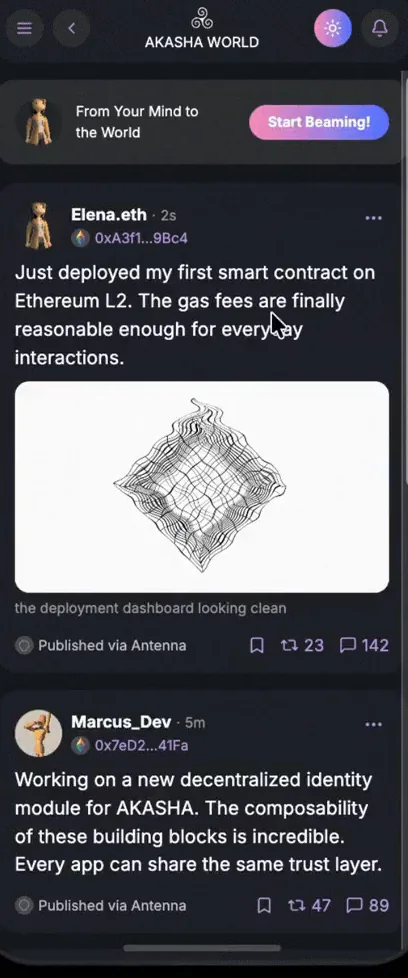
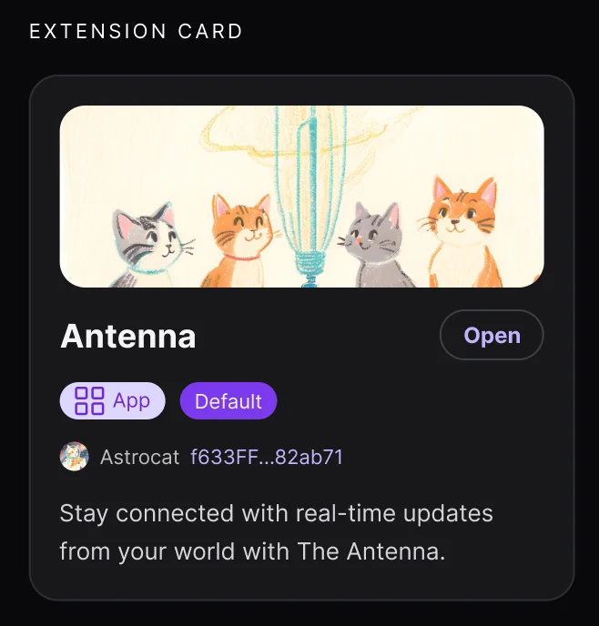
Antenna Feed prompt: Start Beaming!, the default gradient variant 
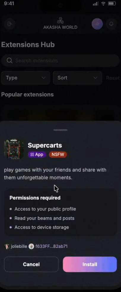
Extensions Install drawer: Cancel as outline, Install as default 
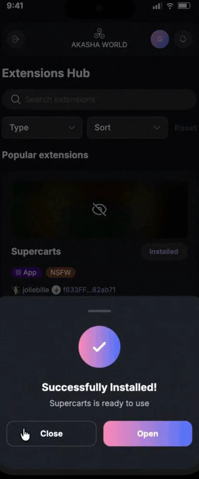
Extensions After install: Close and Open keep the same pair 
Vibes Review queue: Delist as outline, Keep as default 
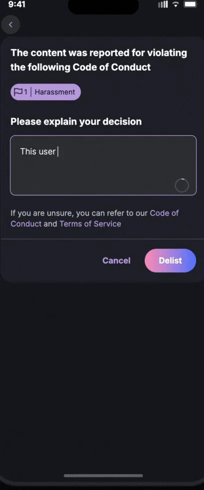
Vibes Decision form: Cancel as a text button, Delist as default