figma community
NeonFi Design System.
Free on Figma Community · Design system for Web3 finance products
the problem
DeFi interfaces carry a lot of weight.
Balances, prices that move every block, gas, slippage, wallet and network states, pending transactions. Dark UIs by default, neon accents everywhere, and very little room for ambiguity: a confusing confirm step costs real money. After years of Web3 and fintech work I kept rebuilding the same foundations for every project.
NeonFi started as my own reusable base for Web3 finance work and became a full system I published to the Figma Community so other teams can skip the first month.
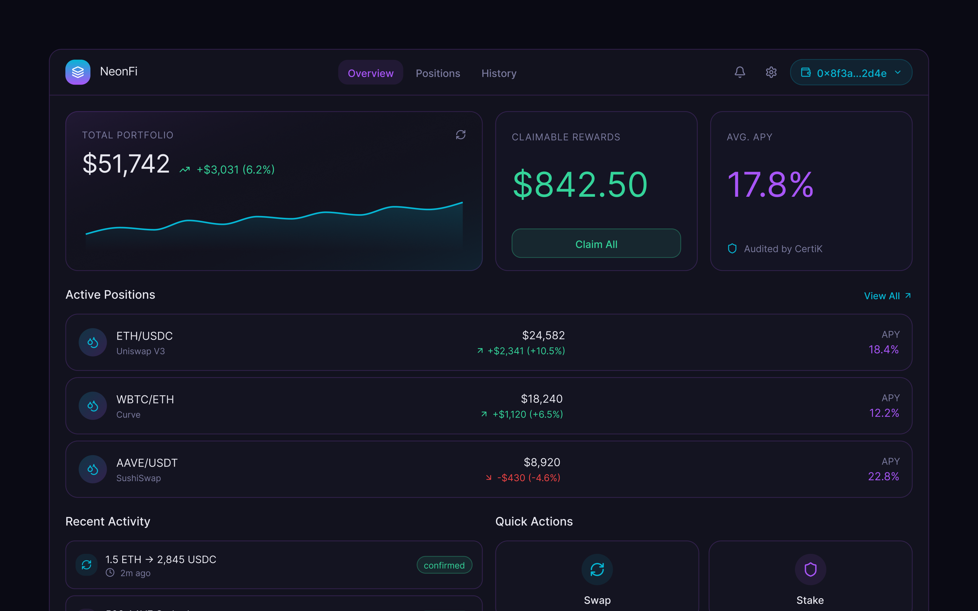
what's inside
From foundations to DeFi patterns.
Color, dark first
A neon palette on deep backgrounds, with a light mode that is a real alternative rather than an inverted afterthought. Contrast checked for the data-dense screens DeFi products actually ship.
Typography and numbers
Tabular figures for balances and prices, a clear hierarchy for the one number that matters on each screen, and consistent treatment for addresses, hashes, and token symbols.
Core components
Buttons, inputs, selects, tabs, badges, tooltips, tables, modals, and navigation, built with variants and states in both modes.
DeFi patterns
Token cards, swap and transaction flows, wallet connect and network switching, pending, success, and failed states, portfolio dashboards. The pieces every Web3 finance product needs on day one.
why it matters
What you get.
Built for Web3 finance
Not a generic kit with a crypto skin. The patterns come from shipping real tokenized finance and DeFi products.
Two modes, one source
Dark and light are maintained together, so a product can offer both without a second design file.
Patterns, not just primitives
Flows and states are included, so teams start from a working swap screen rather than a button.
Free and open
Published on Figma Community. Duplicate it, adapt it, ship with it.