the problem
AKASHA Core spans multiple apps, different teams, and rapid iteration in a decentralised environment. Without a shared design system, UI consistency would degrade, quality would vary across apps, and design-development velocity would slow. The challenge: build a system that scales across the entire ecosystem while allowing individual apps enough autonomy to evolve independently - without creating fragmentation.
foundation: building on Shadcn
AKASHA UI was built on Shadcn UI - composable, unopinionated components that align closely with developer workflows. This gave the system a solid technical foundation without lock-in, letting it grow organically. The decision wasn't cosmetic: by choosing a developer-native foundation, adoption happened because engineers already trusted the base, not because they were mandated to use it.
AKASHA UI - COMPONENT LIBRARY
what I designed
01
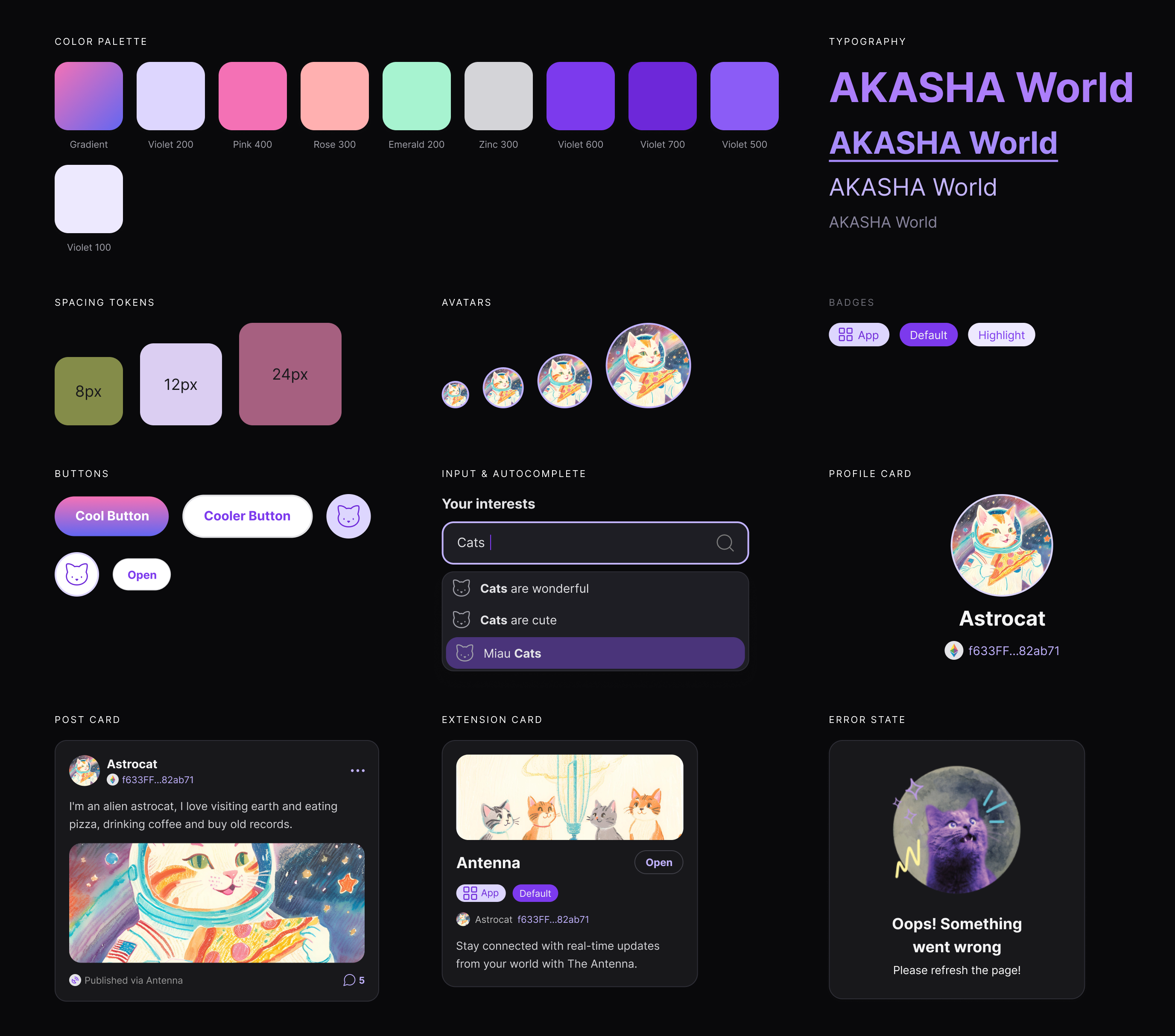
Token architecture
Designed the full token system - colour, spacing, typography, motion, elevation. Every visual decision was a token first, not a hardcoded value. This is what makes theming and extension possible at scale.
02
Component API design
Each component was designed with clear APIs, sensible defaults, and controlled flexibility. The question was always: what can a developer safely customise without breaking the system's coherence?
03
Accessibility baked in
WCAG AA compliance wasn't a post-launch audit - it was a design constraint from day one. Focus states, colour contrast ratios, keyboard navigation, and screen reader semantics were specified at the component level.
04
Documentation as product
The documentation site was treated as a first-class product: usage guidelines, live examples, edge case specs, and accessibility notes. The goal was a system the team could maintain without constant design input.
outcomes
Consistent UI across ecosystem
All AKASHA Core apps now build on the same component foundation - zero negotiation on basic patterns.
Faster development
Engineers ship interfaces faster by composing from the library rather than rebuilding primitives. Fewer design reviews needed for standard patterns.
Open source & adopted
Published, documented, and used by both internal teams and external contributors to the AKASHA ecosystem.
Reduced design debt
Centralising component decisions eliminated the design debt that had accumulated from fragmented, app-by-app design decisions.
↗ Open AKASHA UI documentation