

Strands Labs — Designing Financial Tools for the World's Biggest Banks
One product. Dozens of banks. Millions of users. Every one of them different.
Company
Strands Labs (now Strands by CRIF) — Barcelona-based fintech providing white-label financial management solutions to international bank
Overview
PFM (Personal Finance Management), BFM (Business Finance Management), Engager ,ESG Score Dashboard.
Role
Lead Product Designer
Clients
HSBC, Deutsche Bank, Crédit Agricole, Santander, Banco BPM, Huntington, and 50+ financial institutions worldwide
The Challenge
Strands doesn't build apps for one bank. It builds a single product platform that gets deployed across dozens of banks worldwide — from HSBC in the UK to NCBA in Kenya to BAC Credomatic in Central America.
This creates a design problem that most designers never face: how do you create one experience that works for every bank, every brand, every market, and every regulatory framework — while still feeling personal to each bank's customers?
Each bank has its own brand guidelines, its own customer base (from tech-savvy millennials to conservative retirees), its own regulatory requirements, and its own definition of what "good" looks like. A savings feature that works for a German retail bank doesn't necessarily work for a Kenyan mobile-first bank. An ESG dashboard that makes sense to a European SME might confuse a Latin American business owner.
And yet, the underlying product has to be one codebase, one component library, one design system. Every design decision I made had to balance specificity with flexibility — personal enough to feel like the bank's own product, systematic enough to scale across 50+ deployments.
My Role
I was the Lead Principal Designer, working directly with the Product Owners of each product line. My responsibilities spanned four interconnected products:
PFM (Personal Finance Management) — A mobile-first tool that helps retail banking customers understand their spending, set savings goals, and build better financial habits. Deployed inside banks' own mobile apps, white-labeled to match each bank's brand.
Engager (Personalized Banking Insights) — The intelligence layer powering all of Strands' products. A no-code platform that lets banks create, target, and track personalized financial insights — from spending alerts to savings nudges to cross-selling recommendations — delivered to customers at exactly the right moment based on their transactional behavior.
BFM (Business Finance Management) — A web-based platform helping SMEs manage cash flow, track business expenses, and forecast financial health. More complex data, higher stakes, and users who are often juggling accounting alongside running their business.
ESG Score Dashboard — A web dashboard that gives businesses visibility into their Environmental, Social, and Governance score — with actionable recommendations for improvement. This was a newer product line where I helped define the experience from the ground up.
The Hard Problem: Designing for Everyone Without Designing for No One
The biggest risk in white-label design is creating something so generic it has no personality, or so opinionated it doesn't adapt. I had to find the line between the two.
What I learned early on
When you design a financial tool that will be used by a 25-year-old in Spain and a 55-year-old in Georgia, you can't rely on cultural assumptions. You have to design for universal financial cognition — how people fundamentally think about money, regardless of context.
This meant:
Starting with the decision, not the data. Most financial dashboards show data and hope the user figures out what to do. I flipped this. Every screen I designed started with the question: what action should the user take after seeing this? The data was in service of that action, not the other way around.
Building a flexible design system, not rigid templates. Components needed to be brandable (colors, typography, logo placement) without breaking the information hierarchy. A bank could change its primary color from teal to red, and the interface still had to communicate "savings progress" or "ESG score improvement" clearly.
Designing for the lowest common denominator of financial literacy, while rewarding expertise. A first-time savings user in a developing market and a financially sophisticated European customer both needed to use the same goal-setting feature. The solution was progressive disclosure — simple by default, detailed on demand.
PFM - Savings Goals
Designing a System That Saves Money While Users Forget About It

The problem
Most PFM tools show people where their money went. That's useful, but it's backward-looking. The banks wanted something that drives behavior — not just awareness, but action. The question was: how do you get someone to actually save more, not just feel bad about spending?
What I designed
The savings goal feature was designed around emotional motivation, not just numbers. Each goal gets a personal image (Trip to Bali, New Car, Emergency Fund), a clear progress indicator, and — critically — a set of automated micro-savings mechanics (round-ups, periodic transfers) that make progress feel effortless.
The key design decision was the contextual nudge system. When a user hits a milestone or receives income, the app sends a personalized insight suggesting they increase their savings. The notification isn't generic — it's triggered by the user's actual financial behavior.
For example: a user receives their salary, and a push notification says "You've received an income — how about setting aside some money?" Inside the goal screen, a contextual card suggests "Achieve your goal faster — multiply your round-ups by 4." These aren't random tips. They're data-driven, timed to moments when the user is most likely to act.
The white-label challenge
This feature had to feel native inside every bank's app. Some banks wanted the savings goal to feel playful and aspirational (vacation photos, emoji). Others wanted it conservative and numbers-focused. The component system I built allowed banks to toggle between visual modes without changing the underlying UX architecture.
Engager: Saying the Right Thing at the Right Time
The problem
Banks have mountains of transactional data but most of it sits unused. They know when a customer receives their salary, when spending spikes, when a subscription renews — but they weren't turning that knowledge into timely, helpful communication. Instead, customers got generic marketing emails that felt irrelevant, while the moments that actually mattered (income received, unusual spending, approaching a savings milestone) passed in silence.
The challenge: how do you design personalized financial nudges that feel helpful rather than intrusive, and drive action rather than annoyance?
What I designed
Engager is the intelligence layer that powers contextual, personalized insights across all of Strands' products. My role was designing the customer-facing notification experience — the messages users actually see and interact with.
The design problem wasn't visual — it was behavioral. A notification that arrives at the wrong moment gets dismissed. One that says the wrong thing feels like spam. One that asks too much gets ignored. I had to design a system of insights that hit the intersection of three things: the right trigger, the right message, and the right action.
Trigger design: Each insight is tied to a real behavioral event — not a calendar schedule. "You've received an income" fires when salary hits, not on the 1st of the month. "Your spending on dining is 40% higher than last month" fires when the pattern is real, not as a generic tip. I worked with the PO to define which triggers were meaningful enough to warrant interrupting someone's day, and which were noise.
Message design: Financial notifications walk a fine line between helpful and anxiety-inducing. "You're overspending" creates shame. "You've received an income — how about setting aside some money?" creates opportunity. Every insight I designed was framed around what the user can do, not what they did wrong. The tone had to work across cultures and markets — what feels encouraging in Spain might feel patronizing in Germany.
Action design: Every notification leads somewhere. The income nudge links to the savings goal. The spending alert links to the budget breakdown. The round-up suggestion links to the goal accelerator. No dead-end notifications — every insight is actionable in one tap.
The connection to PFM
Engager is what makes PFM intelligent rather than passive. Without it, the savings goal feature waits for users to remember to save. With Engager, the system watches for the right moment and nudges them to act. The push notification that says "You've received an income" triggers from Engager's behavioral engine but surfaces inside the PFM experience seamlessly.
This cross-product thinking was one of the most interesting design challenges — the user never knows they're interacting with "Engager." They just think their banking app understands them. That invisibility was the design goal.

ESG Score Dashboard: Making Sustainability Actionable
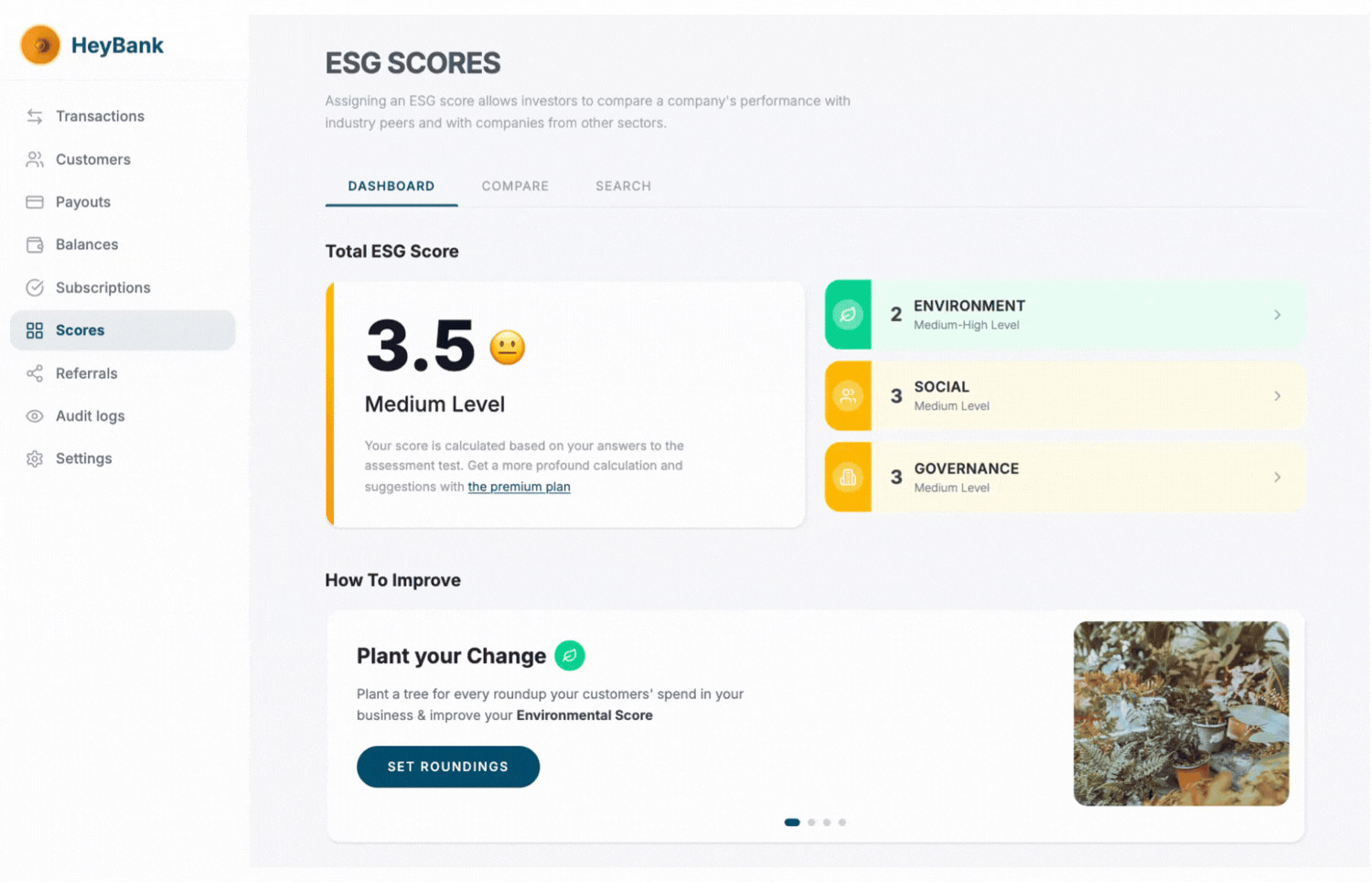
The problem
ESG (Environmental, Social, Governance) scoring was becoming a regulatory and competitive priority for European banks. Businesses needed to understand their ESG position, but existing tools were either too academic (dense reports) or too superficial (a single number with no context).
The challenge: how do you take a complex, multi-dimensional score and make it understandable AND actionable for a small business owner who is not a sustainability expert?
What I designed
The dashboard breaks the ESG score into three clear pillars — Environment, Social, and Governance — each with its own score and drill-down. The total score is presented prominently with an emoji-based sentiment indicator (a simple visual cue that communicates "how am I doing?" faster than a number alone).
But the real design work was in the "How to Improve" section. Most ESG tools tell you your score and stop there. I designed an actionable improvement system where each recommendation shows:
-
What the action is (e.g., "Plant your Change" — tree planting through transaction round-ups)
-
Which pillar it improves (Environmental)
-
How much it can improve the score (Up to 0.5 points)
-
A direct CTA to take the action
This turned the dashboard from a reporting tool into a coaching tool. Users didn't just see their score — they could immediately start improving it.
The scoring explanation
One of the trickiest parts was explaining what the 1–5 scale means. Financial users are used to credit scores (300–850) or letter grades (A, B, C). A 1–5 ESG scale was unfamiliar. I designed a visual scale with color-coded cards, emoji sentiment, and plain-language descriptions for each level — from "High Level" (strong compliance, relevant certifications) to "Low Level" (first steps in adaptation).
The goal was to eliminate the question "Is 3.5 good or bad?" before the user even thinks to ask it.
The comparison and trend features
Businesses don't just want to know their score — they want to know if they're improving and how they compare. I designed:
-
Historic ESG Score Trends — a year-over-year comparison chart showing monthly scores, so businesses can see the trajectory of their sustainability efforts.
-
Compare and Search tabs — allowing businesses to benchmark against peers in their sector
The Design System Challenge

Across all three products, every component I designed had to meet four criteria:
-
Brandable — any bank can apply their visual identity without breaking the UX
-
Localizable — works in LTR and RTL languages, with text that expands/contracts across translations
-
Accessible — WCAG compliant, because banking is a regulated space with accessibility requirements
-
Modular — banks can enable or disable features without the interface feeling incomplete
This meant thinking in systems from day one. Not "what does this screen look like?" but "what does this component do across 50 different contexts?"
Working with Product Owners
Each product had its own PO with different priorities:
-
The PFM PO was focused on engagement metrics — daily active users, savings goal completion rates, notification interaction rates
-
The Engager PO cared about the intelligence layer — insight delivery rates, open rates, conversion to action, and enabling banks to self-serve without needing Strands' team to create every campaign
-
The BFM / ESG PO was balancing two very different products — on the BFM side, business outcomes like cash flow visibility, invoice tracking accuracy, and time-to-insight for SME owners; on the ESG side, navigating a brand-new market, defining what the product even was, while I helped translate emerging regulatory requirements into a usable interface.
My job was to bridge all four — maintaining design consistency across products while respecting that each had fundamentally different users and goals. A retail customer receiving a savings nudge, a bank marketer building an insight campaign, an SME owner reviewing cash flow, and a business checking its ESG score — all needed to feel like they were using a Strands product, even though their contexts were completely different.
Outcomes
-
Deployed across 50+ banks worldwide including HSBC, Deutsche Bank, Crédit Agricole, Santander, Novo Banco, and Huntington
-
Millions of end users across retail and business banking segments on four continents
-
PFM drove measurable increases in savings goal completion rates and daily active engagement across client banks
-
Engager enabled banks to create and launch personalized insights in under two minutes, replacing manual campaign processes that previously took weeks
-
ESG Dashboard launched as a new product line, establishing Strands' position in the growing sustainable finance market
-
The design system enabled new bank deployments in weeks rather than months, with consistent quality across every implementation
What I Learned
Designing for scale is designing for constraints. When your work needs to function across 50 brands, 20 languages, and multiple regulatory frameworks, you stop thinking about pixel-perfect artistry and start thinking about resilient systems. The best design decisions were the ones that held up across the widest range of contexts.
Financial products are trust products. Every interface element either builds or erodes confidence. A confusing chart, an ambiguous label, or an inconsistent interaction pattern doesn't just create a bad experience — it makes people nervous about their money. In finance, usability IS trust.
Action beats awareness. The most impactful design work wasn't making data visible — it was making the next step obvious. Whether it was a savings nudge at the right moment or an ESG improvement action with a clear point value, the designs that drove results were the ones that answered "what should I do now?"